Storybook: The Component Showroom That Stops AI-Generated UI From Drifting
When five people and an AI all write UI code, your buttons quietly multiply. Storybook turns every component into one official showroom — set up in about 10 minutes.

Storybook is a free, open-source tool that lets you build and view UI components — buttons, tables, modals — one at a time, in their own little sandbox, completely separate from your app's backend and business logic. Its real superpower is that it becomes the single official catalogue of every component your team owns. That's what stops your interface from slowly drifting out of shape when several people (or an AI coding assistant) are writing UI code at the same time.
If you've ever thought "our UI keeps ending up inconsistent because everyone — including the AI — just invents their own version of a button", this post is for you.
What is Storybook, in plain English?
Think of a car showroom that displays parts instead of finished cars.
Instead of assembling the whole car before you can check whether the steering wheel feels right, you put the steering wheel, the seat, and the wheel each on its own display stand. You inspect it, adjust it, approve it. Only then do you bolt it into the actual car.
Storybook is that showroom for your app's interface. Each UI component gets its own stand, and you can walk up and look at it without launching your entire application.
Technically: Storybook runs a small website of its own (on http://localhost:6006 by default) that renders your components in isolation — meaning no backend, no login screen, no navigating through five pages to reach the one button you're working on.
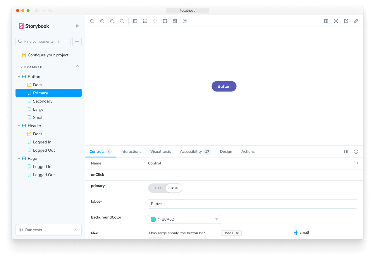 This is the whole idea in one screen: the component in the middle, its list of states on the left, and its editable properties at the bottom. (Source: Storybook Docs)
What is a "story"?
A story is one saved state of one component. That's it.
The official definition from the Storybook team: "A story captures the rendered state of a UI component."
So a single data table component might have four stories:
| Story | What it shows |
|---|---|
| Default | The table with normal data in it |
| Loading | The skeleton or spinner while data is fetching |
| Empty | No data at all — the "No records found" message |
| Dark | The same table on a dark background |
You write these once. From then on, anyone can click through all four in a couple of seconds — no need to break the API on purpose just to see what the error state looks like.
Story files sit right next to the component they describe:
components/
├─ Button/
│  ├─ Button.tsx
│  ├─ Button.stories.tsx
The .stories.tsx file is the showroom label for Button.tsx. Storybook finds it automatically — you don't register it anywhere.
Why should you care?
Here are the five things Storybook actually buys you.
1. You can build UI before the backend exists
Frontend work normally stalls waiting for an API. In Storybook you feed the component fake data directly, so you can finish and polish the design today and connect the real data next week.
2. It stops UI drift — including drift caused by AI
This is the big one, and it's the reason Storybook has become essential now that AI writes so much of our code.
When five people (or one person plus an AI assistant) each need a button, and there's no obvious place to find the existing button, everybody invents a new one. Six months later you have eleven slightly different buttons and nobody knows which is correct.
Storybook fixes this by being the single source of truth. Before anyone writes a new component, they open Storybook and check whether it already exists. It usually does.
⚠️ This works only if your team actually treats Storybook as the reference. If people keep writing components without checking it first, Storybook becomes just another folder of forgotten code. Make "did you check Storybook?" part of code review.
And when a change does break something visually, Storybook's visual testing catches it — it compares screenshots before and after and shows you exactly what moved:
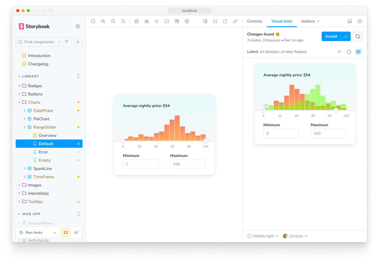 Visual testing flags every pixel that changed and asks a human to approve or reject it — so an accidental UI change can't slip into production unnoticed. (Source: Storybook Docs)
3. It's living documentation that can't go stale
A Figma file or a wiki page describing your components goes out of date the moment someone edits the code. Storybook can't — it renders the actual current code.
That means a designer, a product owner, or a new developer who joined yesterday can open one URL and see every component the product has, in every state, exactly as it really looks today.
4. You can check edge cases in seconds
Very long text. An empty list. A tiny phone screen. Dark mode. Normally you'd have to hunt for real data that triggers each case. In Storybook you just edit the values in the Controls panel and watch the component react instantly.
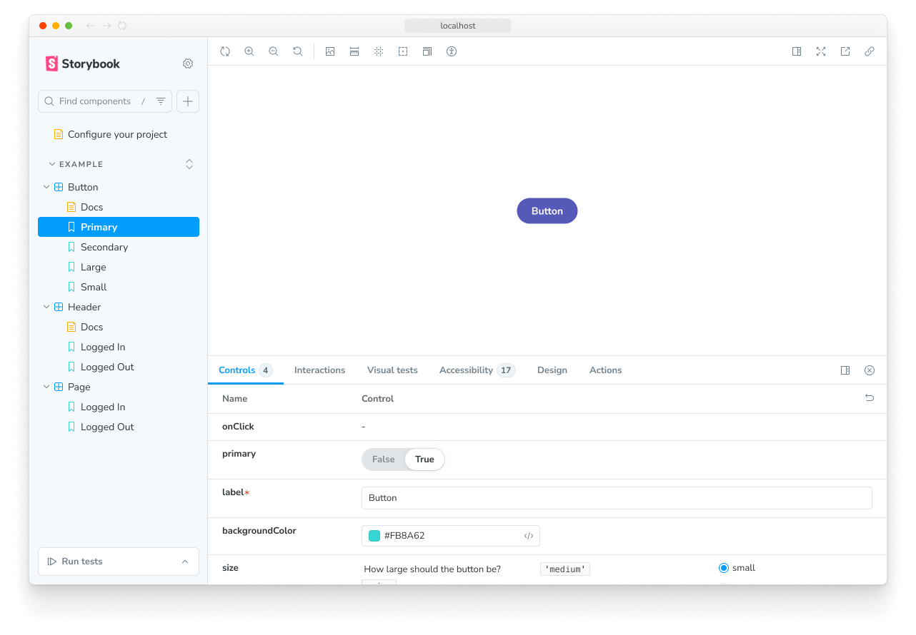 Every property becomes a form field you can type into — no code editing required to test a new value. (Source: Storybook Docs)
5. Designers and developers finally speak the same language
A designer can open Storybook and compare the coded component against the Figma design side by side. Disagreements get settled by looking at the real thing instead of arguing over a screenshot.
What you need before you start
A short checklist:
- Node.js 20 or newer. Storybook 10 is ESM-only, so older Node versions won't run it.
- An existing frontend project. Storybook supports React, Vue 3+, Angular 18+, Svelte 5+, Next.js 14+, Nuxt, SvelteKit, Preact, Solid, Web Components, and React Native, among others.
- About 10 minutes. The installer does most of the work.
⚠️ Check your Node version first with
node -v. If it prints something starting withv18, upgrade before you continue — this is the single most common reason the install fails.
Step 1: Install Storybook
Open a terminal in your project folder and run:
npm create storybook@latest
This downloads Storybook, detects which framework your project uses, writes the config into a new .storybook/ folder, and generates a few example stories so you have something to look at immediately.
You'll be asked a couple of setup questions. The defaults are fine.
Step 2: Start it up
npm run storybook
This launches the Storybook web app and opens http://localhost:6006 in your browser.
What you should see: a page with a sidebar on the left listing example components, a big preview area in the middle, and an addons panel at the bottom.
⚠️ If the browser says the page can't be reached, something else is probably using port 6006. Storybook will usually pick a different port and print it in the terminal — read the terminal output rather than assuming 6006.
Step 3: Write your first story
Create a file called Button.stories.tsx next to your Button.tsx, and put this in it:
import type { Meta, StoryObj } from '@storybook/react';
import { Button } from './Button';

const meta = {
  component: Button,
} satisfies Meta<typeof Button>;

export default meta;
type Story = StoryObj<typeof meta>;

export const Primary: Story = {
  args: {
    primary: true,
    label: 'Button',
  },
};

export const Secondary: Story = {
  args: {
    label: '😄👍😍💯',
  },
};
In plain words: the meta block at the top tells Storybook which component this file is about. Everything exported below it — Primary, Secondary — becomes one entry in the sidebar. The args object is just the props you want that particular version to receive.
That format has a name: CSF (Component Story Format). It's ordinary JavaScript module syntax, so there's no special language to learn.
What you should see: save the file, and two new entries appear under Button in the sidebar. No restart needed.
Step 4: Add the states that matter
Now add the states people actually forget to design for. Same file, more exports:
export const Loading: Story = {
  args: { label: 'Saving…', loading: true },
};

export const Disabled: Story = {
  args: { label: 'Button', disabled: true },
};
Each new export is a new story. This is how a component's "showroom shelf" fills up — one export per state, no clever logic required.
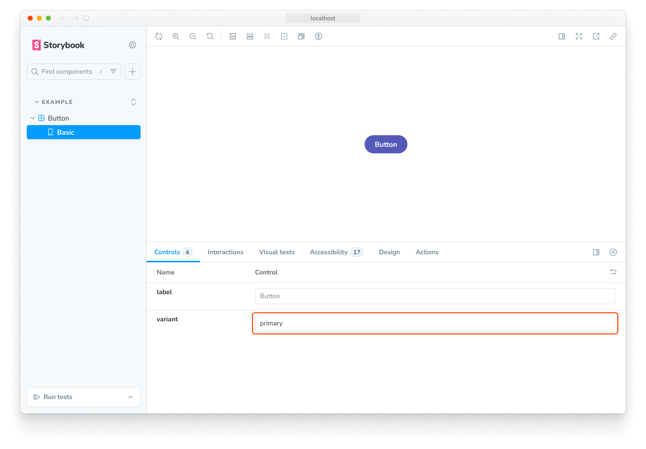 Switching a variant in the Controls panel re-renders the component instantly — this is how you eyeball every visual state in a few seconds. (Source: Storybook Docs)
Step 5: Turn the stories into tests
Here's the part most people miss. Every story you write is already a test case — Storybook can run them automatically and tell you if a component crashes, looks wrong, or breaks accessibility rules.
You can enable the testing features during install:
npm create storybook@latest --features docs test a11y
That adds three things: docs generates a documentation page per component, test runs your stories as automated tests, and a11y checks each component against accessibility rules (contrast, missing labels, keyboard navigation).
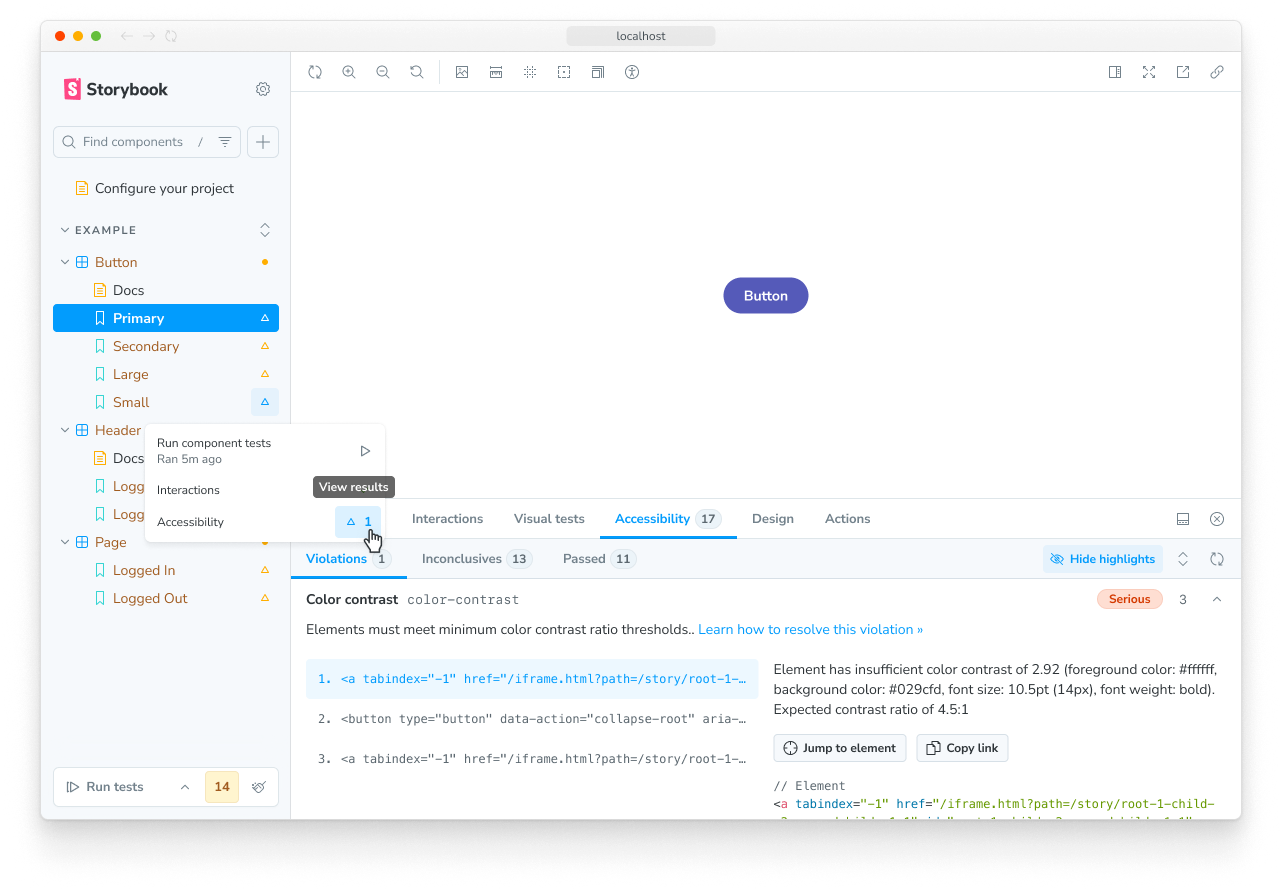 The accessibility addon audits every story automatically and lists exactly which rule failed and where. (Source: Storybook Docs)
Here's a short walkthrough from the Storybook maintainers showing the automated UI testing workflow end to end:
📺 How to Test UI AUTOMATICALLY — Storybook and Chromatic (Chromatic, the team that maintains Storybook)
What you just did
- You installed a private "showroom" website for your project's UI, running alongside your app.
- You wrote stories — saved snapshots of each component in each of its states — so nobody has to guess what a component is supposed to look like.
- You turned those same stories into automatic checks that catch UI drift before your users do.
FAQ
Do I need Storybook on a small project? Probably not if you're working solo on something short-lived. It earns its keep the moment a second person — or an AI assistant — starts writing UI code, because that's when components start duplicating.
Does Storybook slow my app down? No. It's a separate development tool that never ships to your users. Your production bundle is unchanged.
Do I have to write a story for every component? No. Start with the components that get reused most — buttons, inputs, cards, tables. Those are where inconsistency does the most damage. Add the rest gradually.
Can Storybook stop an AI assistant from inventing new components? Not by itself — it's a catalogue, not a guard. But it gives the AI (and your teammates) a definitive list of what already exists, which is exactly the context needed to reuse instead of reinvent. Point your AI tooling at your Storybook and the duplication drops sharply.
How much does it cost? Storybook itself is free and open source. Some hosted extras — like Chromatic for cloud visual testing — are paid services, but you don't need them to get the core benefits.
References
- Storybook — Install
- Storybook — What's a story?
- Storybook — How to write stories
- Storybook — How to test UIs
- Storybook — Migration guide for Storybook 10
- Screenshots courtesy of the official Storybook documentation.
#Storybook #FrontendDevelopment #DesignSystem #UIComponents #React #WebDevelopment #AICoding #DeveloperTools
✍️ The Author: Do Ngoc Hoan Founder of CookConnects.ca & Wizy.ca. Bridging the gap between advanced algorithms and business execution. I write for technical founders looking to scale their impact with AI and robust engineering.